Optimizing Webfont Selection and Synthesis
 A "webfont" is a set of resources, not just a single download. A single resource that includes all stylistic variants, which we may not need, plus all the characters, which may go unused, would simply be too large — tens of megabytes for a font with good unicode and stylistic coverage!
As a result, the CSS @font-face rule allows us define a font family that is composed of many individual resources: regular font weight plus multiple bold and oblique variants, each of which can be responsible for a particular unicode range. In turn, each of these variants is backed by a separate font resource, which enables us to split and minimize the number of bytes required to get the critical text pixels on the screen.
@font-face {
  font-family: 'Awesome Font';
  font-style: normal;
  font-weight: 400; /* regular */
  src: url('/fonts/awesome-normal.woff2') format('woff2');
  unicode-range: U+0370-03FF; /* greek */
}

@font-face {
  font-family: 'Awesome Font';
  font-style: bold;
  font-weight: 700; /* bold */
  src: url('/fonts/awesome-bold.woff2') format('woff2');
  unicode-range: U+0370-03FF; /* greek */
}

body { font-family: 'Awesome Font' }
.title { font-weight: 600 }
.subtitle { font-style: italic }
The above example declares the "Awesome Font" family that is composed of two resources that cover the same set of Greek characters (U+0370-03FF) but offer two different "weights": normal (400), and bold (700). However, what happens if one of our CSS rules specifies a different font weight, or sets the font-style property to italic?
Font selection algorithm
When a weight is specified for which no face exists, a face with a nearby weight is used. In general, bold weights map to faces with heavier weights and light weights map to faces with lighter weights (see the font matching section below for a precise definition).
The @font-face rule is specifically designed to provide the browser with a flexible selection mechanism: if an exact stylistic font match is not available the browser will substitute the closest match, and if none is available, it will synthesize its own font variant. For the curious, the font matching algorithm gets into the gritty details. For example, the selection rules for font-weight are:
- If the desired weight is less than 400, weights below the desired weight are checked in descending order followed by weights above the desired weight in ascending order until a match is found.
- If the desired weight is greater than 500, weights above the desired weight are checked in ascending order followed by weights below the desired weight in descending order until a match is found.
- If the desired weight is 400, 500 is checked first and then the rule for desired weights less than 400 is used.
- If the desired weight is 500, 400 is checked first and then the rule for desired weights less than 400 is used.
As a result, our .title selector in above example would end up rendering text with the 700 variant in place of the requested 600 weight. However, what about the .subtitle, which needs an oblique font?
Font synthesis
If no suitable match is found, the browser will attempt to synthesize the necessary font variant. The details of how to generate the bold and oblique variants are not specified, hence the results will vary from browser to browser, and will also be highly dependent on the font. As a hands-on example, consider what happens with Open Sans:
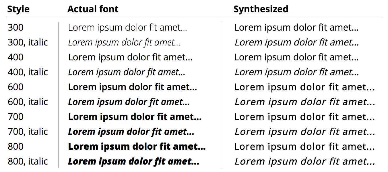
Google fonts provides ten different variants, each at ~15KB for the latin character set, or ~150KB in total. Alternatively, the rightmost column provides a preview of the synthesized variants generated from the same (400 weight) variant. As you can tell, there is a noticeable difference, plus a number of additional limitations. The browser:
- Can't make a bold font lighter.
- Can't make an oblique font "straight".
- Has limited ability to synthesize bold(er) fonts.
- Has limited ability to synthesize oblique fonts and may produce wrong shapes - e.g. inspect the lowercase "f" in the synthesized vs. actual columns.
Typography geeks will provide a much longer list of why the synthesized version is inferior, but it's not just the looks:
Authors should also be aware that synthesized approaches may not be suitable for scripts like Cyrillic, where italic forms are very different in shape. It is always better to use an actual italic font rather than rely on a synthetic version.
The browser is simply applying some geometric transformations to the letter shapes and hoping for the best. Often, the results are pretty good, but we do need to be careful about how and where font synthesis is used. On that note, it is worth highlighting that the CSS specification does provide the font-synthesis property to control font synthesis behavior. However, while all browsers support font synthesis, to date only Firefox has implemented the CSS API:
.selector {
  font-synthesis: none;           /* disable synthesis */
  font-synthesis: weight;        /* bold synthesis only */
  font-synthesis: style;           /* italic synthesis only */
  font-synthesis: weight style; /* bold + italic synthesis (default) */
}
Font synthesis as performance optimization?
The obvious question to ask is whether we can rely on font synthesis in lieu of an extra resource download? After all, each font resource adds extra bytes and may delay rendering of page content.
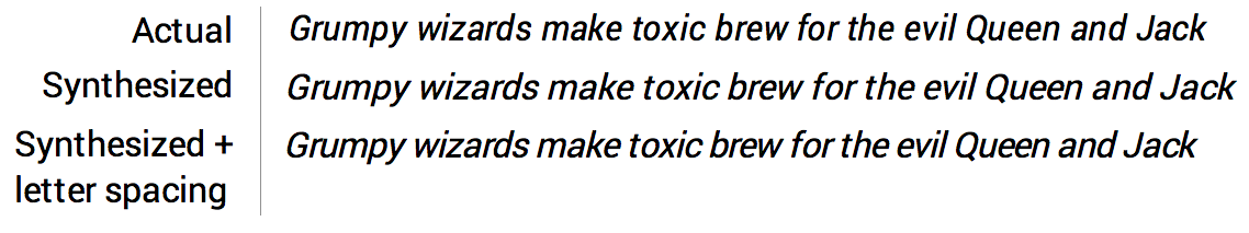
The synthesized version of oblique Roboto in example above may not look as good, but with a little fiddling (e.g. letter-spacing: -0.3px) can nonetheless produce reasonable results while avoiding the extra font request.
As a practical example, this site is using Open Sans with two variants: 400 for regular text and 700 for bold. I've tried eliminating the 700 variant and using the synthesized version in the past, and while it didn't look as good (to me), I didn't hear any complaints from the visitors. In the end, I still reverted to requesting both (personal preference), but continued to use the synthesized oblique fonts, which is what you're reading this very moment - surprise!
Your mileage may vary, but it's always a good exercise to periodically sit down and audit what fonts your site is using and ask whether you actually need all of them. In the best case, you can consolidate your styles to use fewer variants, and where you can't, consider if you can rely on the browser to synthesize some font variants on your behalf!
 Ilya Grigorik is a web ecosystem engineer, author of High Performance Browser Networking (O'Reilly), and Principal Engineer at Shopify — follow on Twitter.